In my last post, we discussed the problem that text controls residing in a FlipView are not scrolled / moved to the top area when the Windows touch keyboard fades in at the bottom area of the screen. In this post, we take a look at the keyboard dismiss problem that also occurs when you put input controls into a FlipView.
Analyzing the problem
Let’s start with the simplest context possible: if you create a form view consisting of input controls that are placed within a panel (e.g. a StackPanel), and the touch keyboard is currently visible because the user is editing a text control, then you would expect the keyboard to fade out when the user taps on the background of the form (i.e. he or she does not hit any other input controls). This works totally fine in UWP apps if one uses the UI elements I just described, as you can see in the two following images:

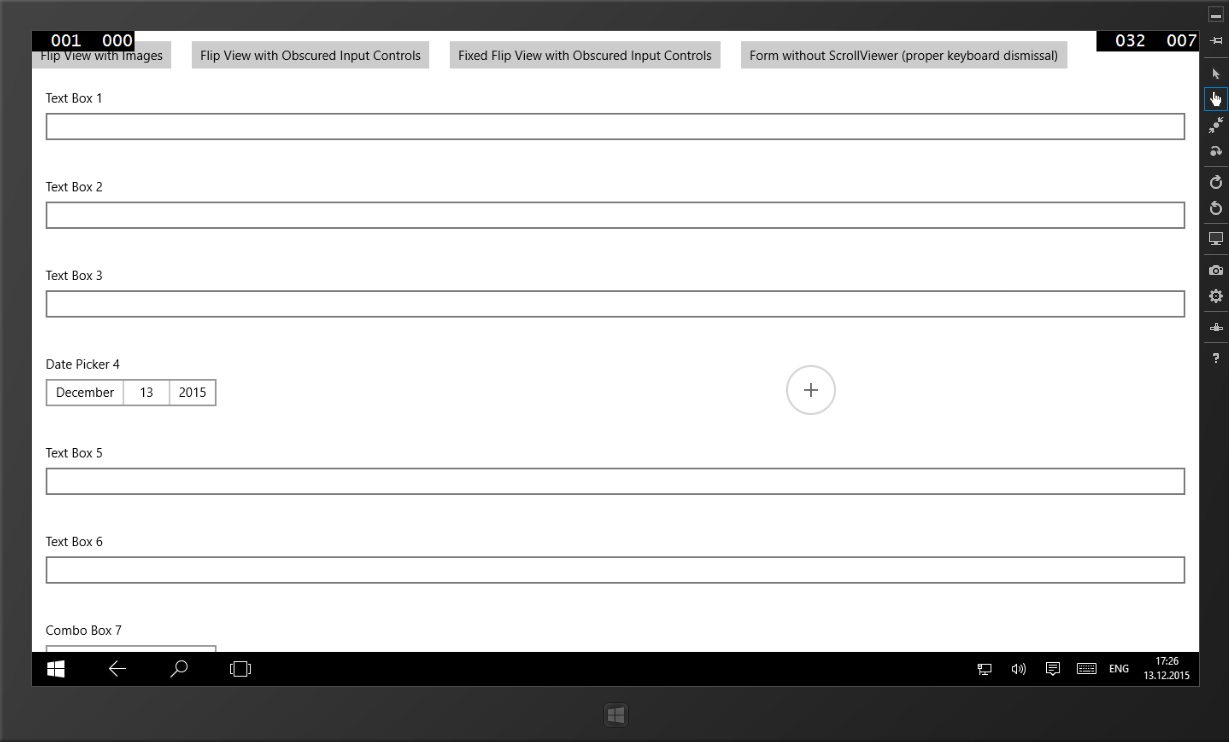
However, we cannot scroll to the input controls that are below Combo Box 7, so let’s add a ScrollViewer and a FlipView to the mix. When you perform the same experiment now, you will see that the touch keyboard is not dismissed and instead, the first input control in your form is focused:
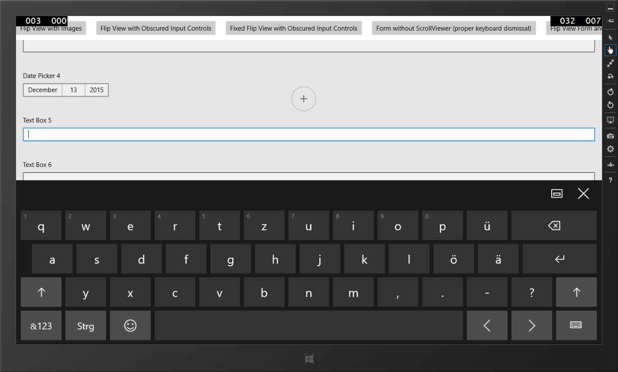
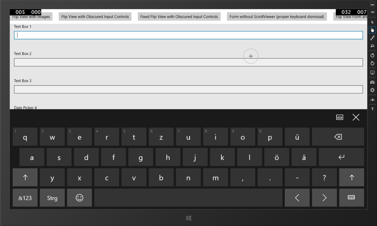
Why is this happening? Well, in this case it is not the FlipView, but the ScrollViewer wrapping the panel containing the actual input controls that’s causing the problem.
The ScrollViewer does not receive focus, but forwards it to the first focusable child element
To better illustrate how the different UI Elements are nested within each other, let’s check out one of Visual Studio 2015’s great new features: the Live Visual Tree. With it you can inspect the Visual Tree that was created from your XAML at run-time. In my example, it looks like this:
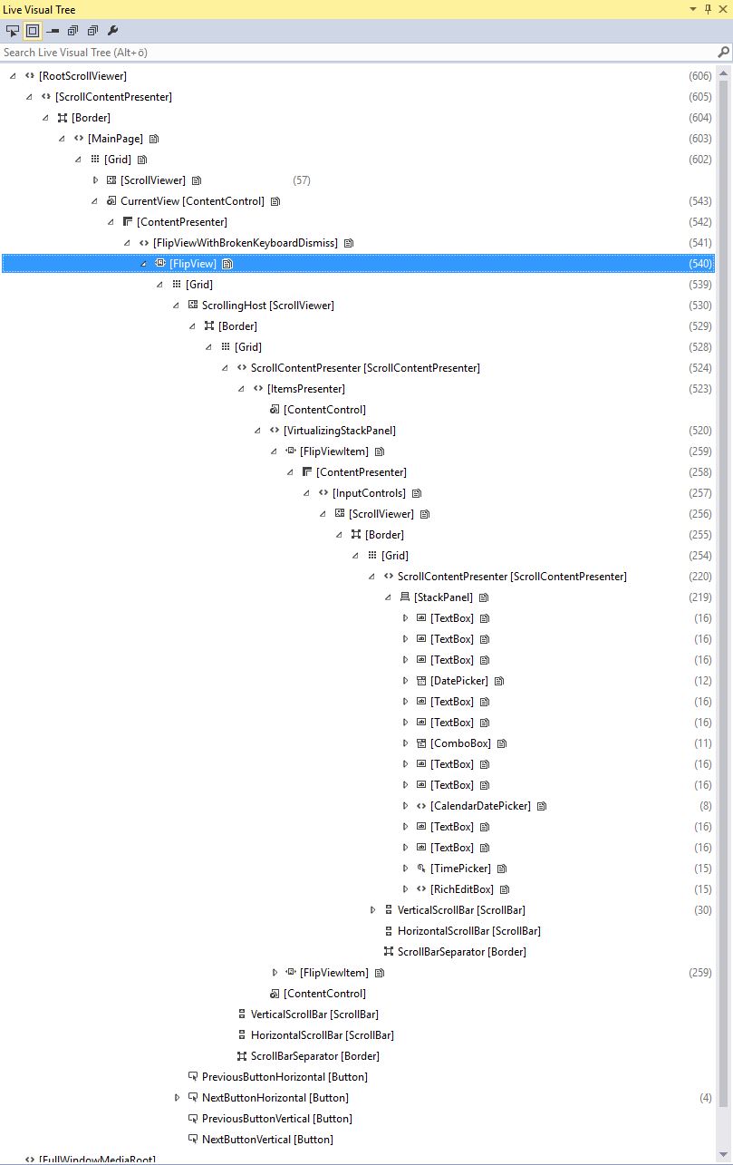
As you can see, I marked the FlipView that we’re actually talking about and it contains a lot of child items, so let’s dig through them to get to the problematic elements:
- The FlipView itself contains a Grid that arranges the ScrollViewer and some buttons that can be used to flip to the next item. If these are tapped, then the ScrollViewer is instructed to scroll to the next item – so it is actually this element performing the heavy lifting within the FlipView. By default, this ScrollViewer only works horizontally.
- The ScrollViewer then consists of a Border, a Grid, the scroll bars and another Border used as the ScrollBarSeparator. The most important part of a ScrollViewer is its ScrollContentPresenter which gives its child unlimited size in the specified directions (horizontal and/or vertical) so that it can take up as much space as it needs.
- The ScrollContentPresenter then contains the actual items of the FlipView – they are wrapped within an ItemsPresenter (as it is the case with all ItemsControls). You then see the VirtualizingStackPanel we talked about in the last post – I did not exchange it for this example (but you should in your production code). The ContentControl elements above and below the panel are for the header and footer of the FlipView – I did not use them in this example, too.
- This panel then hosts the different FlipViewItems which in turn host our actual content – here you can see that there is an additional ScrollViewer per FlipViewItem that works only vertically so that the user can scroll to input controls that are not within the view port.
- And finally there is the StackPanel hosting our actual form controls.
With this somewhat complex Visual Tree in mind, let’s strip all unnecessary elements away and focus on the key players to understand what’s really going on.
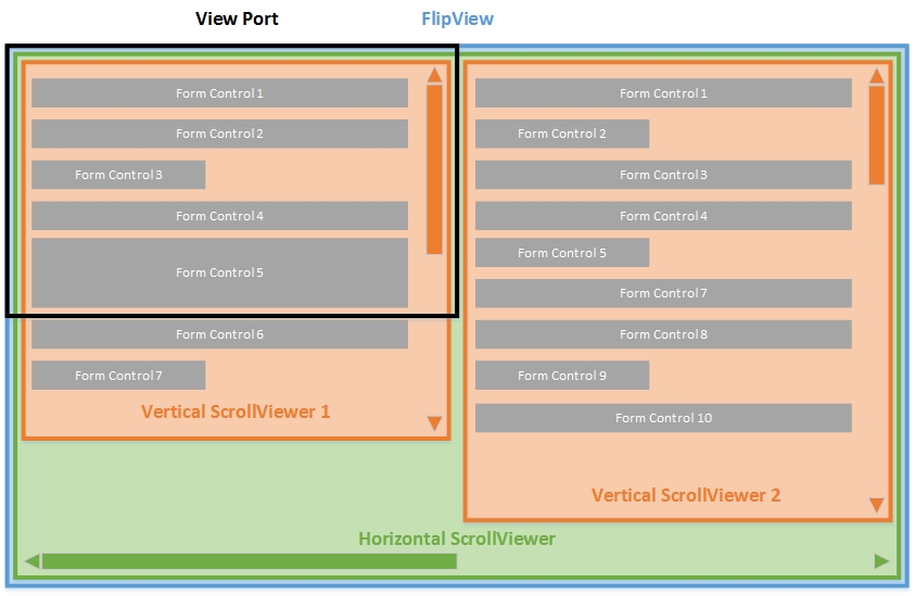
In the image above, you can see the FlipView indicated in blue, the horizontal ScrollViewer of the FlipView in green, and two vertical ScrollViewers in orange, each of them containing a panel with form controls. The black box indicates the view port which is just the part of the view the user can currently see through his or her screen. Now let’s discuss some common interactions that the user will likely perform:
- If the user wants to scroll up or down in the current form, then he or she will touch the background with a single finger and drag it up or down. These events are captured and handled by one of the vertical scroll viewers so that it can adjust the portion of the screen that will be visible in the view port.
- If the user wants to flip to another form view, he or she will touch the background with a single finger and drag it left or right. These events arrive at the vertical ScrollViewer first, but it does not handle them, and thus the events bubble up to the parent horizontal ScrollViewer, who will perform the actual flip to the next item in the FlipView.
- If the user wants to input data to a form control, he or she will tap on it. The control receives and handles this event and get focused. If it is a text control, the touch keyboard will fade in and the vertical scroll viewer should move / scroll the input to the upper section.
But what happens when the user just taps on the form background to dismiss the touch keyboard? Of course, this event is handled by the one of the vertical ScrollViewers first, and because a ScrollViewer is no TabStop by default, it will get the first focusable child item (in our case the first text box within the form panel) and focus it instead. Now the behavior we explored makes perfect sense, and the only thing you have to do is setting the ScrollViewer.IsTabStop property to true.
To focus correctly is not that easy
In the end, the solution to that problem was not so hard, but you should keep some details about focus and the touch keyboard in mind:
- Only controls can be focused, no borders, panels, or anything else not deriving from the Control base class.
- The touch keyboard does appear when a text control is focused, but only when the user initiated the focus by performing a gesture. It will not appear if you set the focus programmatically.
- The touch keyboard will disappear if a none text control is focused (it doesn’t matter if the focus was changed by the user or through code). However, there are some controls like CheckBox, ComboBox, RadioButton or List that will keep the touch keyboard open – Microsoft argues that this would streamline the user experience as the touch keyboard will probably stay open as long as the user fills out a form.
- With that in mind, you can actually respond to events to position your content when the touch keyboard becomes visible or hidden. Use the InputPane class for this purpose.
In conclusion, I would definitely advise you to read Microsoft’s Keyboard Design Guidelines to know all things necessary about the touch keyboard.
Summary
If you create forms in UWP apps and place them within other controls like a ScrollViewer or FlipView, please ensure that you set ScrollViewer.IsTabStop to true on all ScrollViewers that you control. Otherwise you might experience a strange keyboard dismiss behavior as a ScrollViewer tries to focus the first control within your current form – and this is not very user-friendly.
Check out the source code for this post on GitHub.
Comments
Currently there are no comments for this post. Write the first one!